


Designed and built for OKA’s US launch, the content of the email was to introduce the US market to the OKA brand. Eclectic, modern, with Eastern influences, this introductory email was designed to entice an organic response. Rather than being forward and selling the products, the content was chosen to sell an idea as to why the British Brand was different.
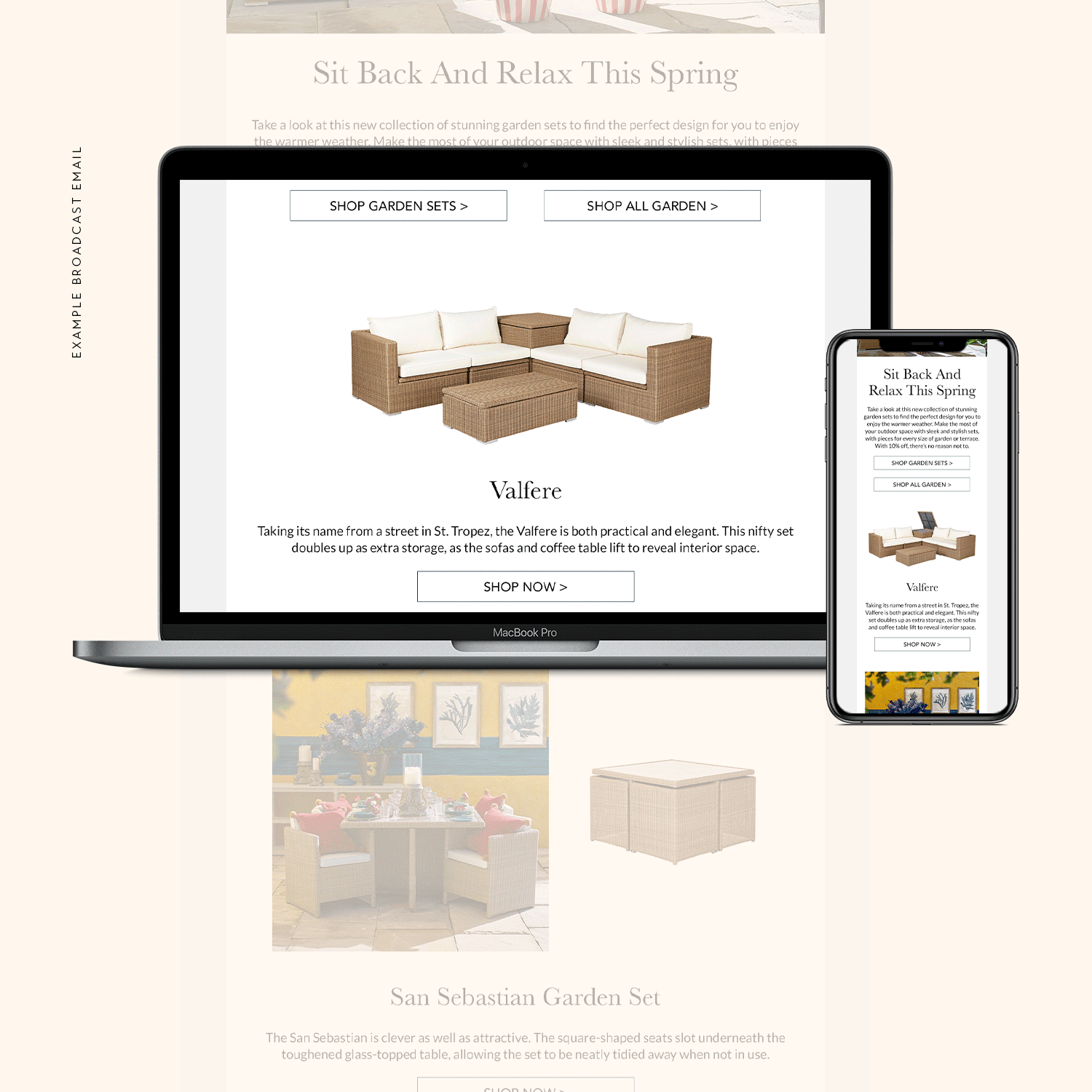
All emails presented were built and designed responsively for both desktop and mobile.
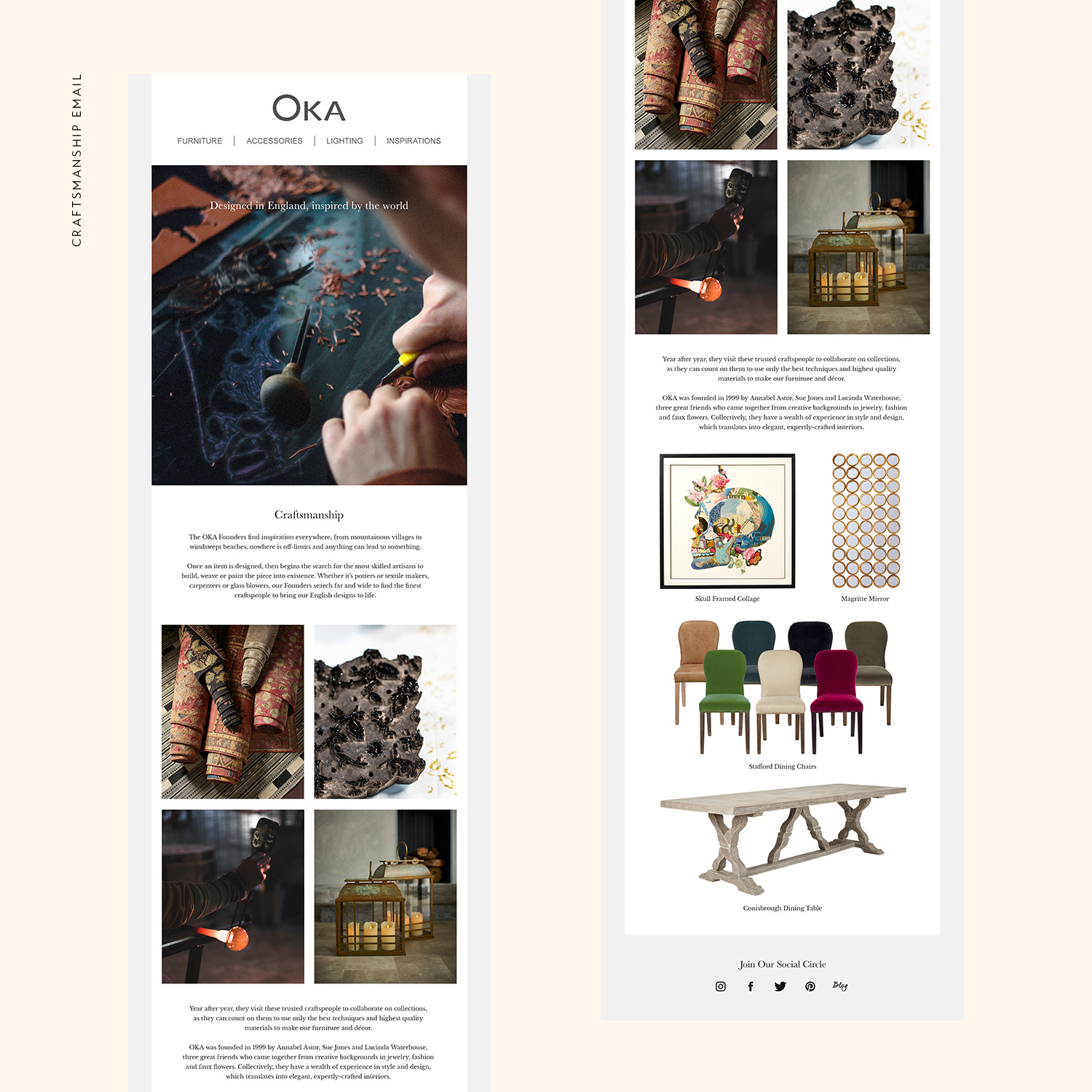
A follow on email from the Welcome email, this would be sent out to customers who haven’t yet bought from the initial email to draw them in further. Going into more detail of the hand-crafted nature of some of the pieces, there was a greater emphasis of quality of the products.
Large lifestyle shots and close-ups of products, the second half pushes the hero products of the brand.
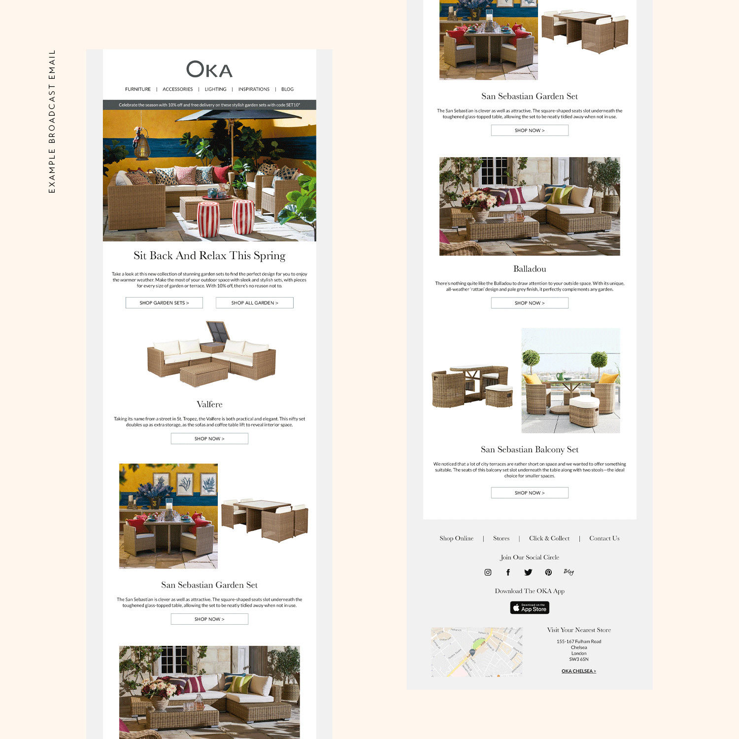
This example email was sent out to promote OKA’s garden rattan range. To fully present their additional features, such as the compact nature of the San Sebastian range, GIFs were used to animate the email. A simple loop adding a dynamic aspect to the email.
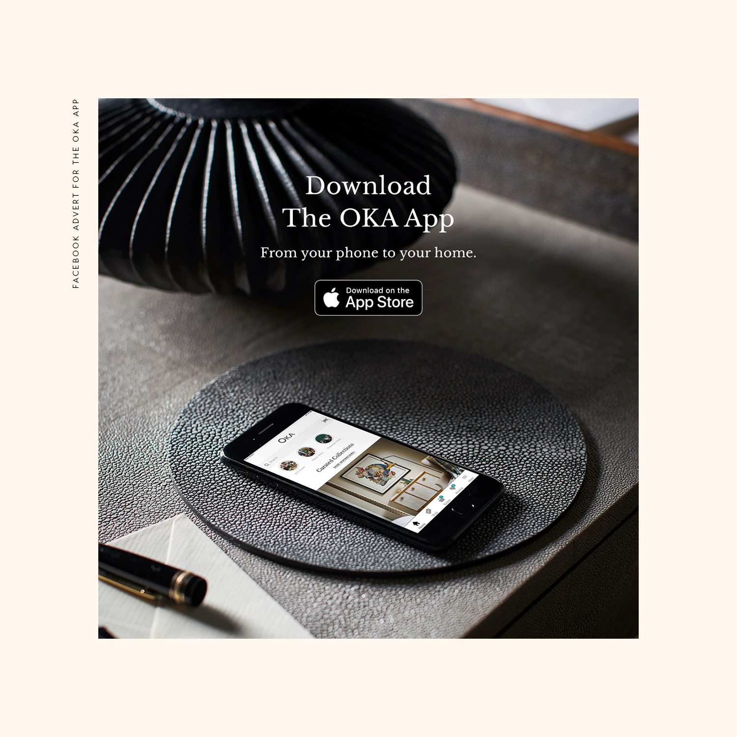
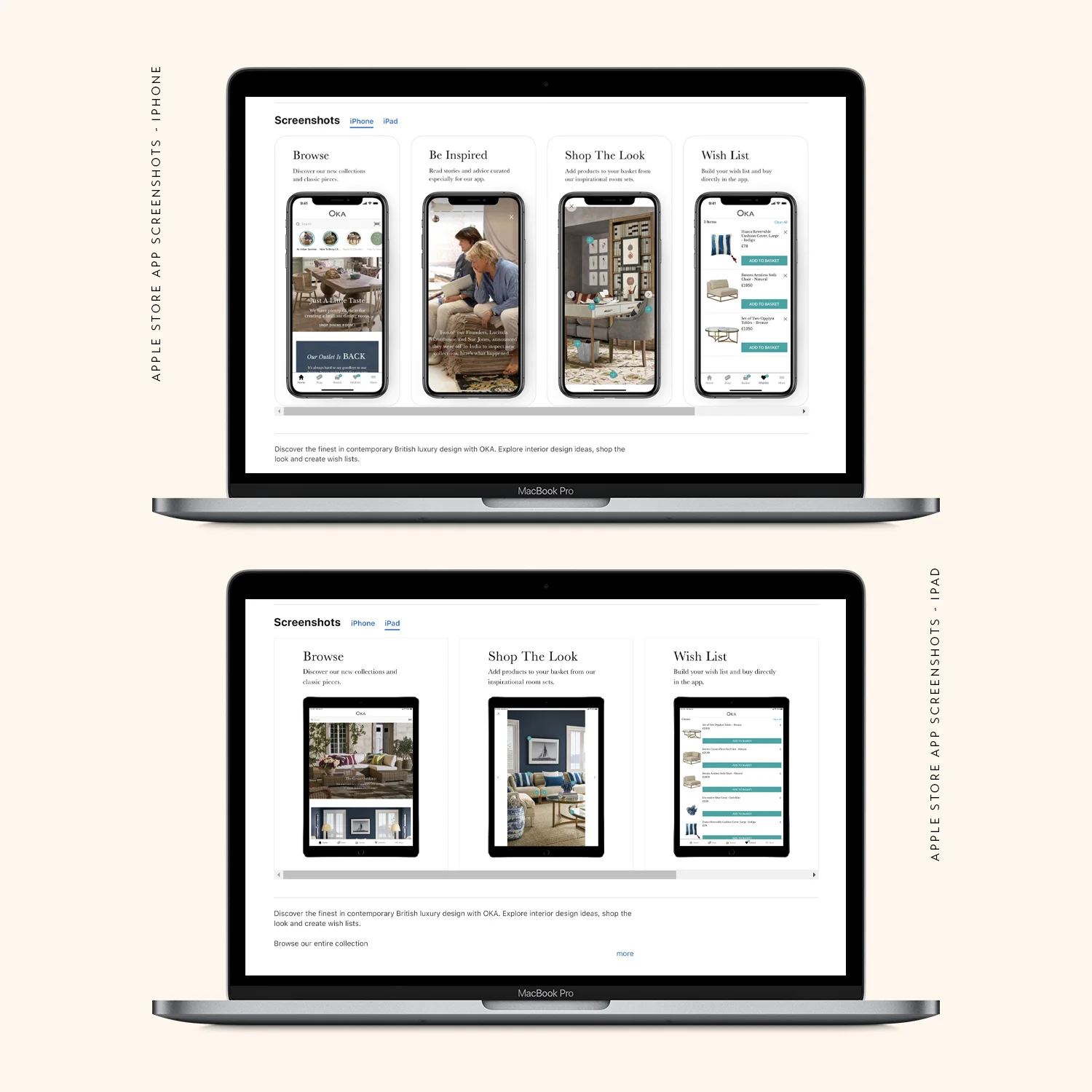
The OKA App was built early 2019, working alongside Poq to create a new channel for OKA to push. Photography taken specifically for the advertising before the App was finalised, the screen was retouched to show the finished app in situ.
Due to the short turnaround, the work was split among the team. I was tasked with the initial homepage layout of the app, stories and the advertising that would push the product.
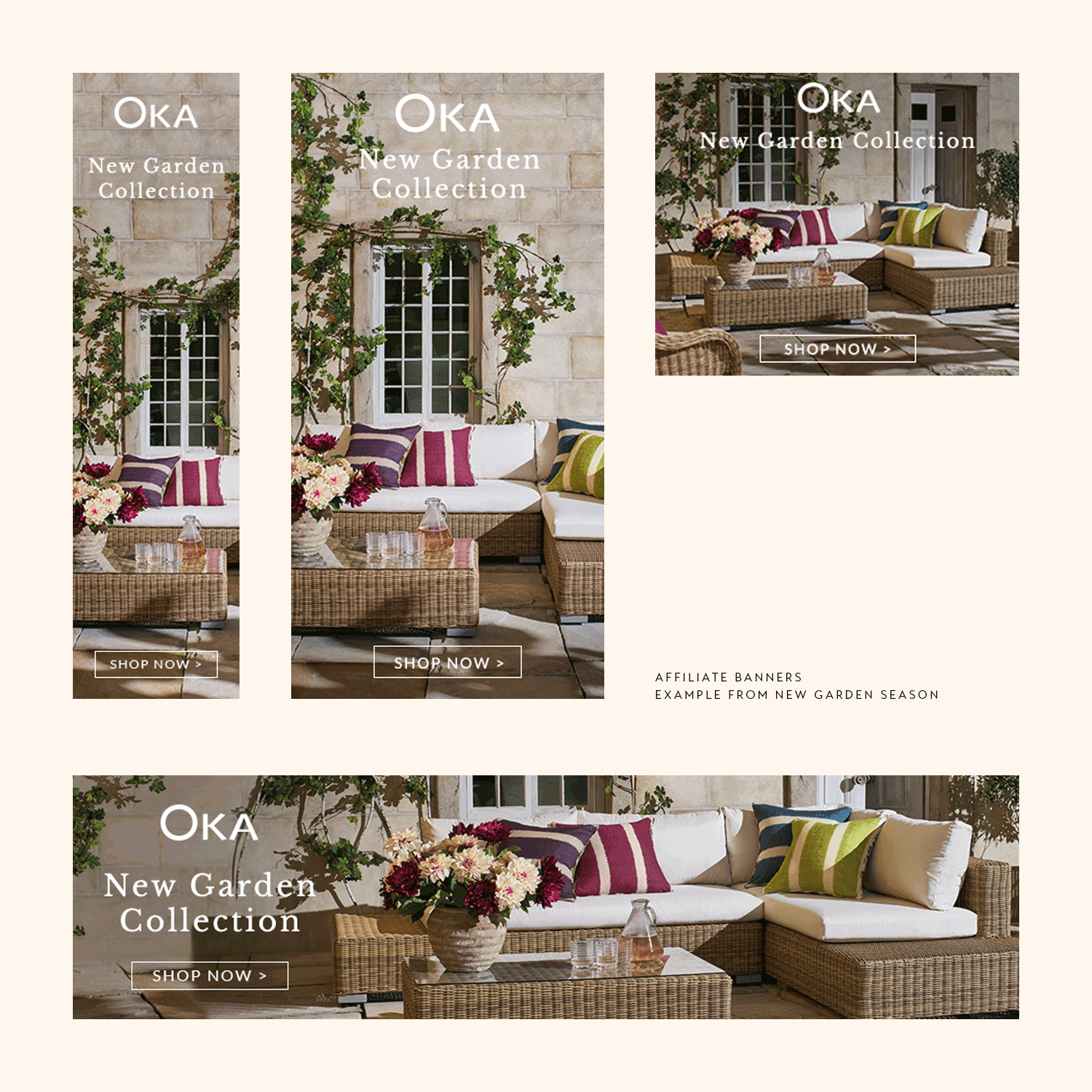
The example affiliate banners were used for the launch of the New Garden Collection.
Changed with each new season, the banners would be seen across the web, design and imagery varying with each launch.